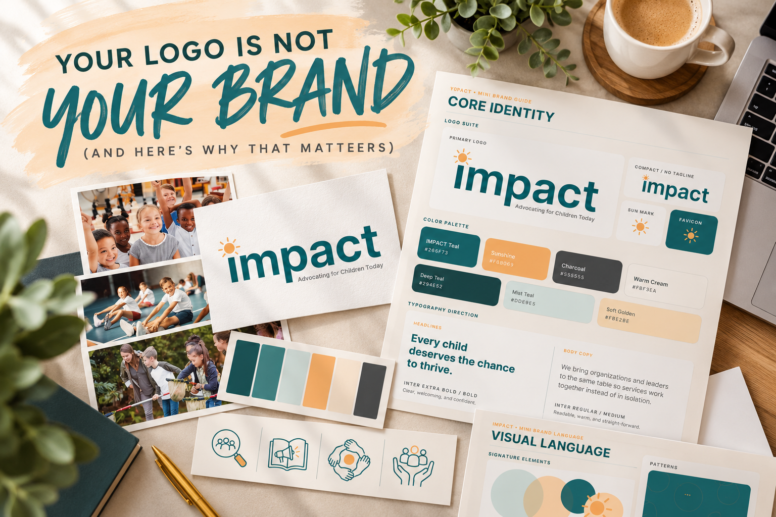
You have a logo. Maybe you even LOVE your logo.
But here's the thing…
Your logo isn't your brand. (Yep, I said it! 😉)
Don't get me wrong. A great logo is important! It's often the first thing people notice about your business. But your brand is so much bigger than that little graphic sitting at the top of your website.
Your brand is the whole experience. It's how your business looks, feels, communicates, and connects with people.
And when all those pieces work together? That's when the magic happens!
So, What's the Difference Between a Logo and a Brand?
Think of your logo as the face of your business.
It's the visual symbol people recognize. Your brand identity, on the other hand, is everything that helps create a consistent, recognizable look and feel.
We're talking about:
Your logo: The visual representation of your business.
Your colors: The palette that sets the mood and creates recognition.
Your fonts: The typography that communicates your personality.
Your imagery: The photos, graphics, and illustrations that tell your story.
Your voice: The way you communicate with your audience.
And beyond the visuals, your brand includes the experience people have when they interact with your business.
Your logo is one piece of the puzzle. Your brand is the whole picture.
Why Brand Consistency Matters
Have you ever visited a business's website, clicked over to its Facebook page, and wondered if you were looking at the same company?
Different logos. Different colors. Completely different styles.
It's confusing, right?
When your branding is consistent, people begin to recognize your business wherever they encounter it.
Your website, business cards, social media graphics, brochures, and even your email signature should feel like they belong to the same family.
That doesn't mean everything needs to look identical. (How boring would that be?!)
It means everything should feel connected.
Consistency builds recognition. Recognition builds familiarity. And familiarity helps build trust.
A Real-Life Example: Bringing a Brand to Life
Let's look at a real example!
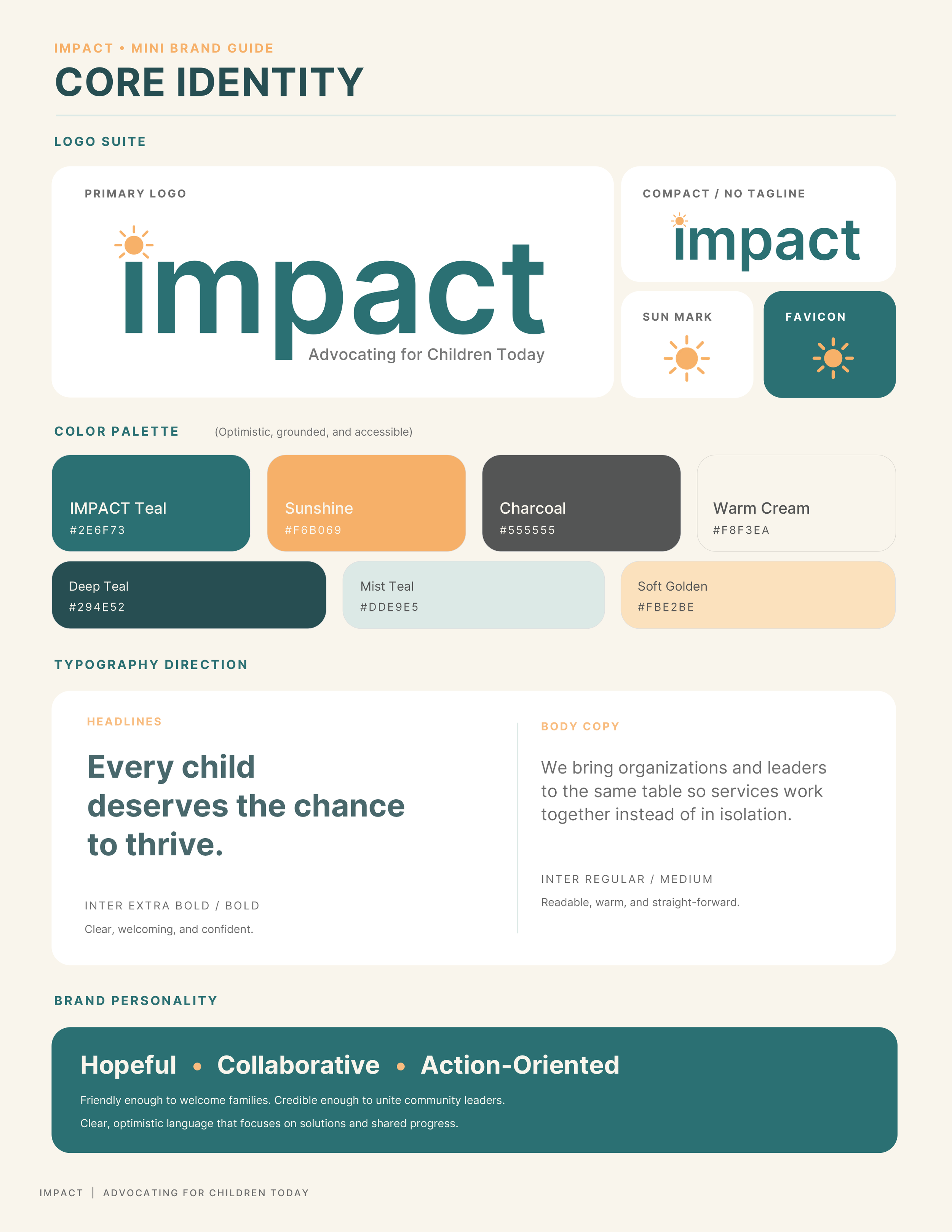
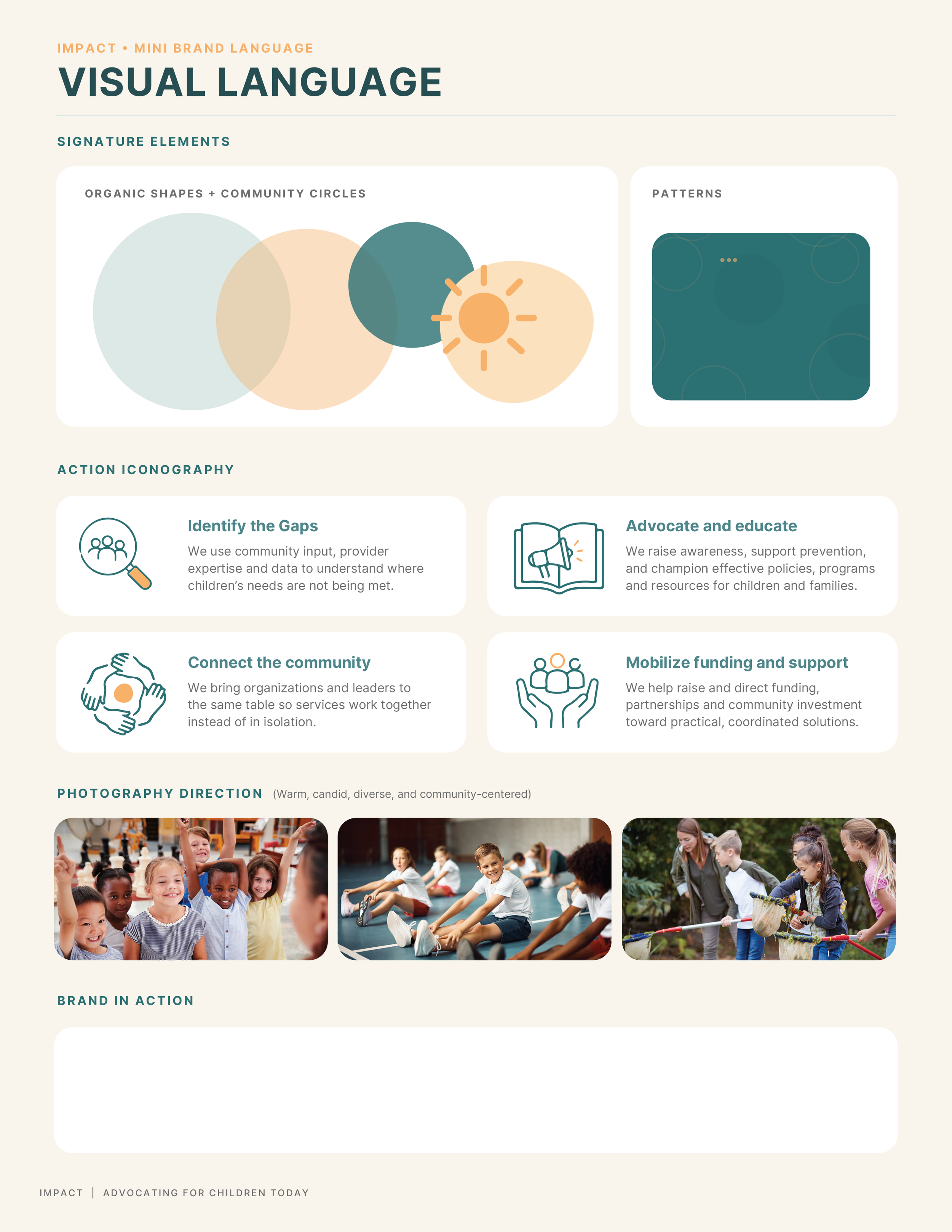
When I worked on the branding for Impact for Children, the goal wasn't simply to create a logo. It was to develop a visual identity that reflected their mission of advocating for children and bringing communities together.
We started with a clean, modern logo featuring a little sunshine element representing hope and positivity. ☀️
But we didn't stop there!
We developed a coordinated color palette, typography guidelines, custom icons, patterns, and photography direction to create a complete visual identity.
The teal brings a sense of trust and stability, while the warm orange adds optimism and energy. The overlapping circles represent connection and collaboration, reinforcing the organization's mission.
Now, whether Impact is creating a website, developing marketing materials, or sending an email, they have a consistent visual foundation to work from.
And THAT is the difference between designing a logo and building a brand!
It's not about making everything look exactly the same. It's about creating a recognizable identity that tells your story wherever people encounter your business.
Does Your Business Need a Complete Rebrand?
Not necessarily!
Sometimes business owners assume that if their branding feels outdated, they need to throw everything out and start over.
But that isn't always the case.
Maybe you still love your logo, but your website looks like it belongs to a completely different business.
Maybe your colors have changed over the years, and now you're using five different shades of blue. (We've all seen it! 😂)
Or maybe you have a beautiful logo but no idea which fonts, colors, or graphics to use when creating marketing materials.
That's where a brand refresh or brand style guide can make a BIG difference.
A few thoughtful updates can bring everything together without losing the recognition you've already built.
The Secret Weapon? A Brand Style Guide!
If you've ever found yourself asking, "Wait, which green did we use?" or "What font is that again?" — you need a brand style guide!
Think of it as your business's visual cheat sheet.
A brand style guide keeps your logo variations, brand colors, fonts, and design guidelines organized in one place.
That means whether you're creating a social media post, ordering business cards, or updating your website, you're not starting from scratch every time.
No more guessing. No more mismatched colors. No more random fonts making surprise appearances.
Just consistent, professional branding.
And who doesn't love that?!
Ready to Bring Your Brand Together?
Here's what I always want business owners to remember:
You don't need the biggest marketing budget or the fanciest logo to create a memorable brand.
You need a clear identity, a consistent look, and a message that connects with your audience.
At Dream Big Creative Design, I love helping small businesses turn their ideas into a cohesive, professional brand that actually feels like them.
Whether you need a new logo, a Brand Style Kit to organize your visual identity, or a Full Brand Exploration to build something from the ground up, I'd love to help!
Because your business deserves more than just a pretty logo.
It deserves a brand that makes an impression.
Dream Big. Create Boldly. Be Unmistakably You.